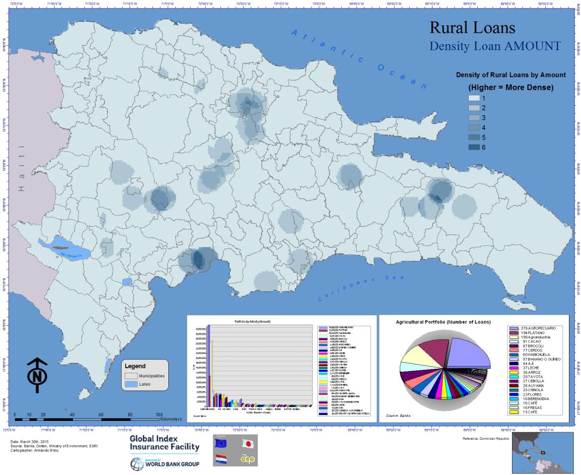
Rural Loans - Density of Loan Amounts

This map was created using data on rural loans. The GIS analysis shows where the density of loan amounts is higher (as opposed to where there are more individual loans). It is meant to highlight where the larger loans are concentrated. Notice that there are areas with many individual loans and low amount density.
The methodology used to draw the map is as follows: The banks provided portfolio data with x/y coordinates in WGS84 format, which where projected and added to a basemap. Using the “point density” geographic analysis under the spatial analyst in ArcGIS 10.3, we derived a density of points according to space and value (amounts of loans). The total was divided into 6 distinct categories –using “equal interval”, and re-classified in simple scale ( 1 to 6). The map is completed with two graphics showing the total agricultural portfolio (number of loans), where we found that the largest number of loans are for agricultural/livestock (379), Plantains (194), Agroindustrial (189), and cacao (91); and the total portfolio by loan number/amount, where we found that the total amounts of loans for all plantains are lower when compared with agroindustrial and agricultural/livestock. Therefore, plantain loans amounts are many, but their amounts are much less than the top agricultural porfolio by number of loans
